Elevation
Use depth to create hierarchy and spatial contrast, focusing user attention.
Matchbox uses elevation to define the distance between multiple objects along the z-axis. It’s a visual tool which uses depth to create hierarchy and spatial contrast, focusing user attention.
Box Shadows
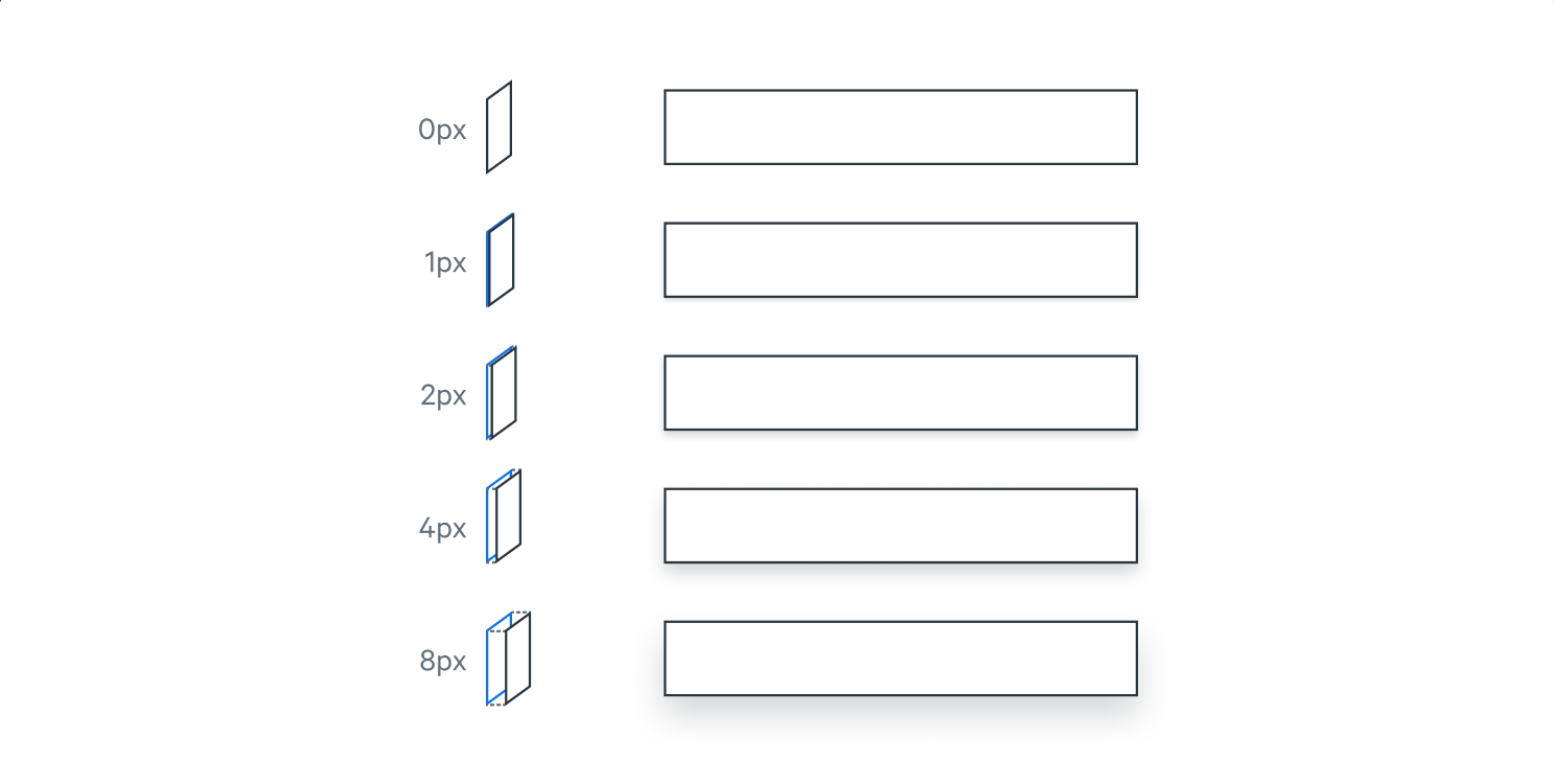
All UI elements sit on imagined planes. The distance between the front of one plane to the front of another plane creates a depth, which Matchbox depicts by use of box shadows. The intensity and size of the shadow cast visually implies elevation.

Using Elevation
Shadows should be used infrequently on static, non-interactive UI elements as they are often a visual cue to users, indicating component interactivity. Elements should be given a higher elevation, creating a shadow, during interaction (e.g. hovering, clicking) or to draw the attention of the user to specific tasks (like in modals, drawers, and trays).
Box Shadow Tokens
All imagined planes sit atop a scale beginning at the base plane of 0px. With consideration to spatial contrast against the base plane, Matchbox uses four variants of elevation, reflected by the Box Shadow tokens.
| Example | Token | X Y RGBA | Code |
|---|---|---|---|
| Box Shadow 400 | |||
| Box Shadow 300 | |||
| Box Shadow 200 | |||
| Box Shadow 100 | |||
| Box Shadow 0 |