System Props
System props provide direct access to design tokens, without writing a single like of CSS.
System props are props that directly access a theme. In the following example, the blue.700 color is being applied to the Box component.
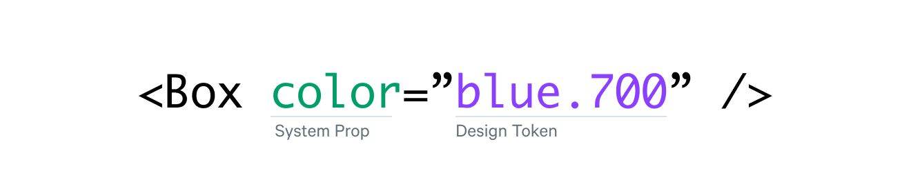
In this example, the system prop, color, looks for a value named blue.700 in the theme provided by the ThemeProvider component.
Each React component in Matchbox is given access to certain groups of system props depending on the flexibility and requirements of that component. Every component API page is documented with the system props allowed for that component. Box is the only component that has access to every system prop.
Non-Token Values
System props also work with non-token values. You can pass through any value so long as it is a valid CSS value for that property.
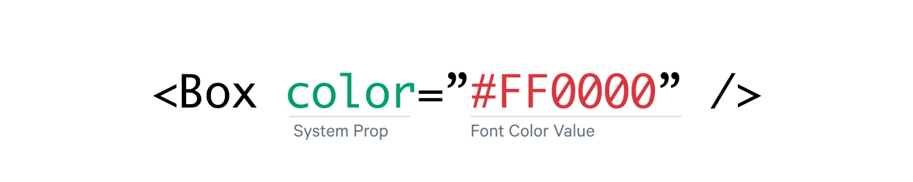
In this example, color is set to a hexadecimal value instead of referencing a design token.
You can also pass in numerical values or expressions.

Responsive System Props
System props also allow you to easily create media query breakpoints by passing in an array.
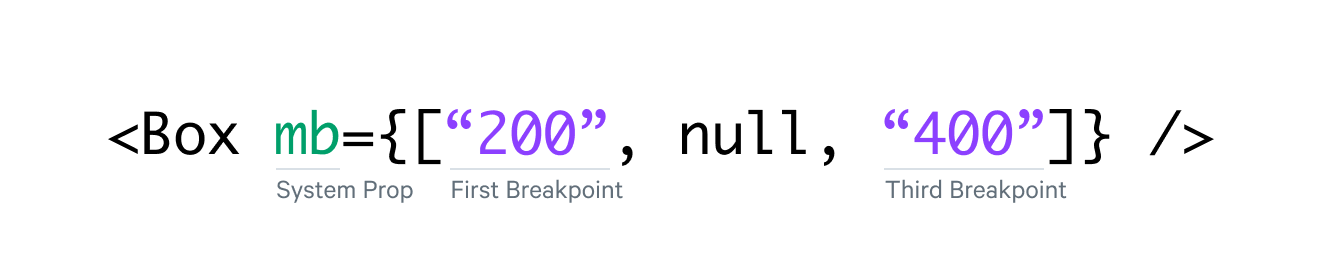
Here, this component is applying different margin-bottom values at different breakpoints. Responsive arrays operate on a min-width basis, meaning spacing 200 will be used up to the third breakpoint, and spacing 400 will be used after the third breakpoint.
Categories
System props are organized into categories of props, which decide which design tokens are available to that prop. These categories are:
borderborderborderWidthborderStyleborderColorborderRadiusborderTopborderTopLeftRadiusborderTopRightRadiusborderRightborderBottomborderBottomLeftRadiusborderBottomRightRadiusborderLeftborderXborderYborderTopWidthborderTopColorborderTopStyleborderBottomWidthborderBottomColorborderBottomStyleborderLeftWidthborderLeftColorborderLeftStyleborderRightWidthborderRightColorborderRightStylecolorcolorbackgroundColoropacitybgflexboxalignItemsalignContentjustifyItemsjustifyContentflexWrapflexDirectionflexflexGrowflexShrinkflexBasisjustifySelfalignSelfordergridgridGapgridColumnGapgridRowGapgridColumngridRowgridAutoFlowgridAutoColumnsgridAutoRowsgridTemplateColumnsgridTemplateRowsgridTemplateAreasgridArealayoutwidthheightminWidthminHeightmaxWidthmaxHeightsizeoverflowoverflowXoverflowYdisplayverticalAlignpositionpositionzIndextoprightbottomleftshadowboxShadowtextShadowspacemarginmarginTopmarginRightmarginBottommarginLeftmarginXmarginYmmtmrmbmlmxmypaddingpaddingToppaddingRightpaddingBottompaddingLeftpaddingXpaddingYpptprpbplpxpytypographyfontFamilyfontSizefontWeightlineHeightletterSpacingtextAlignfontStyleOne each component API page, you will see a list of available system props.
The Theme.js File
Matchbox's theme file is extendable through the ThemeProvider component, useful for building your own themes. See the theme file on Github.