Typography
Typography is used to maintain readability and visual hierarchy.
Matchbox uses a predefined set of typefaces, font styling, and guidelines to ensure cohesive and clear communication across all experiences. Typography standards are used to maintain readability and visual hierarchy, directly impacting how a user interprets information.
Font Stacks
Matchbox mainly uses the Calibre font. It is the primary typeface of the base font stack token, Font Family Sans. In situations where Calibre may be unavailable (i.e. fails to load), Font Family Sans will default to native system font families. Note, Calibre is visually small with a low baseline; when paired with other typefaces, size adjustments should be made to account for the difference in visual weight.
When displaying code, defer to the monospace font stack. The monospace font token, Font Family Monospace, defaults to the respective native monospace font families.
Styles
Font Weight
Three font weights are used: Normal, Medium, and Semibold. While the font weight, Light, is available, it should be used sparingly.

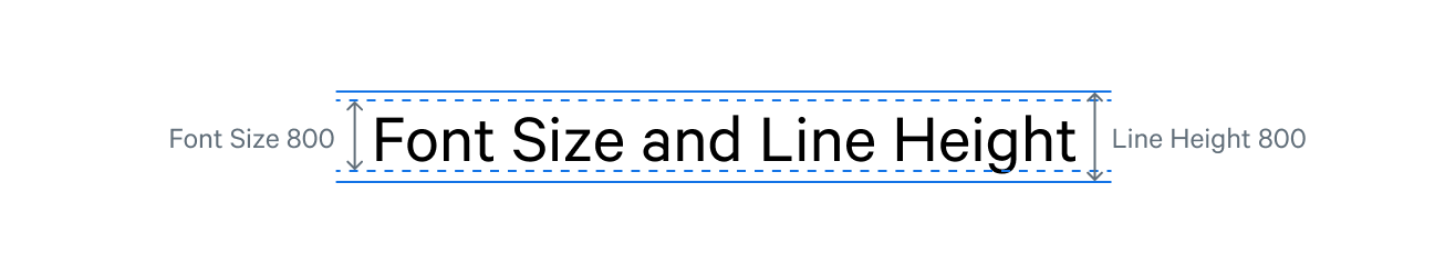
Font Size and Line Height
Each font size is paired with a specific line height (e.g. Font Size 300 should be used with Line Height 300). The ratio given to each set is intentional, with the goal of optimal readability and accessibility for users of all abilities.
Usage and Pairings
Guidelines for combining font family, font size, font weight, and line height help maintain consistency and hierarchy and act as an instructions-for-use tool.
Select the typography variables to view the respective Matchbox font values.
| Font Family | Font Weight |
|---|---|
| Example | Font Size | Line Height |
|---|---|---|
Sans 800 | ||
Sans 700 | ||
Sans 600 | ||
Sans 500 | ||
Sans 400 | ||
Sans 300 | ||
Sans 200 | ||
Sans 100 | ||
Sans 50 |