Forms
Forms are a collection of related inputs used to gather information from the user
What are forms?
Forms are common user interfaces that are used to get information or data from the user. They can be simple or complex and can be presented in a variety of ways depending on the situation.
Types of form fields
Component | Use | Example |
To capture several words | Name, Password, Address | |
Multiline TextField | To capture several lines of text | Feedback, Description |
To select one or more choices | Add an optional item, Accept terms of use | |
To choose one of two binary options | Enable, Mute | |
To select only one of several choices | Category | |
To select only one of a few choices | User role | |
To select a numerical value or range from a minimum and maximum | Alert threshold | |
To select a date or range of dates | Scheduling events | |
File Uploader | To upload or attach a file or multiple files | Import recipient list |
Labeling
Labels allow the user to quickly scan through forms and are required on every field:
- Be clear and concise. Labels should not be longer than two to three words
- Labels should use title-case
- Labels should be placed above and to the left of the relevant input control
- Do not use colons after the label
- Required fields should not be visually marked as required
- Optional fields should be marked as optional
Structure
Headings
Forms should always have a title that describes the form.
Grouping Fields
Longer forms with several groups of fields can split each group with panel sections along with sub headers. Fields should be grouped together by relevance. Fields that are directly related to each other may be grouped horizontally.
Ordering
Follow a logical and predictable order when placing fields. For example, a login form should display email before password.
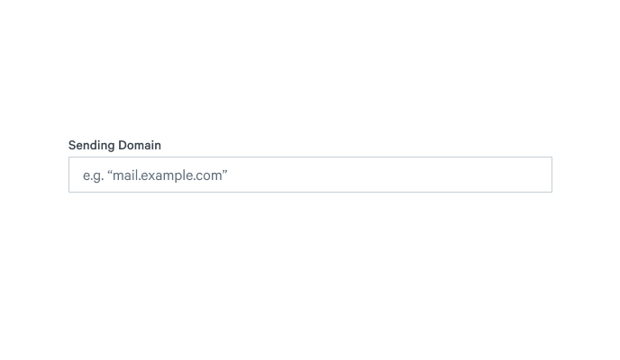
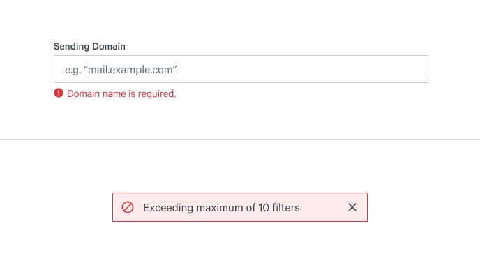
Placeholder Text
- Field placeholders should never be used as labels. This prevents a user from identifying the input required for the field once they begin to fill it.
- Placeholder text should be limited to example text only in the (e.g.) format
- Placeholder examples should be as short as possible to not overflow the width of the input
- Placeholder examples should use anonymized examples rather than real values
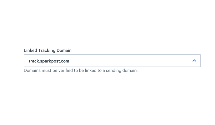
Help Text
Help text is used to assist the user with understanding how to complete a single form field. Help text can be presented to the user in two different ways, either below the relevant field or through tooltips.
Client Side Validation
Client side validation or error messaging assists the user with understanding how to properly complete a form. It informs the user what and where the issue is, and provides guidance on how to correct it. Error messaging should occur at the field level, to help identify which fields need correcting. If an error message pertains to multiple fields, a Banner should be displayed at the form level.
Field-level error messages should only be visible if:
- The field has an invalid value
- The field has been touched by the user
- The field has been blurred at least once
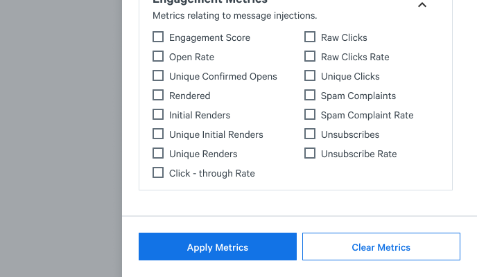
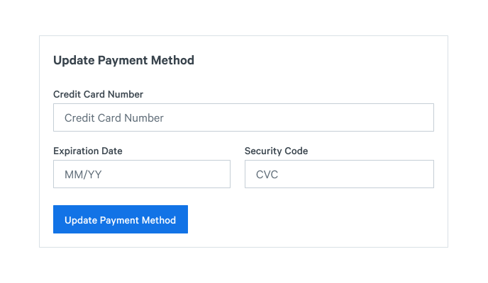
Buttons in a form
Buttons in a form are used to either submit the form, or to discard changes. Use a filled blue button for the primary action, and an outlined blue button for the secondary action.
Submit buttons should always appear on the bottom left corner of the form. Submit buttons should never be top-aligned.
Submit button labels should always tell the user what to expect. Use a verb & noun combination to describe your submit action.