Modals
Modals are used to present critical information or prompt the user for input
What are modals?
Modals, or dialogs, are stopping points in a user experience that intentionally introduce friction. They are disruptive by design. The purpose of a modal should be clear to the user as soon as it is presented, and a path to completion should be obvious.
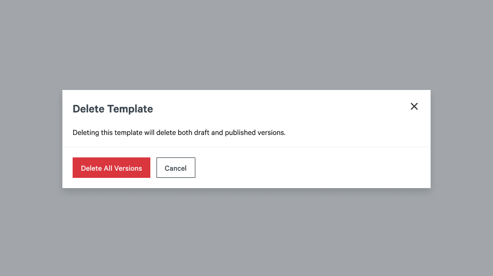
Example Modal
When to use modals?
Because of their intrusive nature, modals should only be used in a few situations:
- Use to present critical information
- Use to prompt the user for information
- Use to confirm a decision for potentially destructive or irreversible actions
Best Practices
Modals should always be expected
Opening a modal should always be initiated by clicking a button. A modal should be expected by a user through a user-triggered action and should never open unprompted.
Modals should be used sparingly
Modals are disruptive and cause friction. Only use them when intentionally disrupting a user flow or experience. Modals can annoy the user if they are used too frequently.
Modals should be focused
Within a modal, content length should be short and concise so as to fit within the browser’s viewport. Never use a modal to display a large amount of information or data. Modals should be simple to complete or dismiss and have a clear call to action.
Accessibility
Focus
When a modal is opened, focus should be placed on the modal’s container. Focus should also be trapped to the modal’s contents. The underlying page should be unfocusable and unreachable through keyboard navigation.
Dismissing Modals
A modal should be closed when the following happens:
- The
ESCkey is pressed - The
Cancelbutton in the modal’s footer is pressed - The
Xin the modal’s header is pressed - Clicking anywhere outside the modal’s container