Matchbox 7.1.0
For more detailed release notes, please visit the Matchbox repository on Github.
This update includes changes to two existing components, RadioCard and Tag, and adds three new components to the library:
New Components
QueryCard
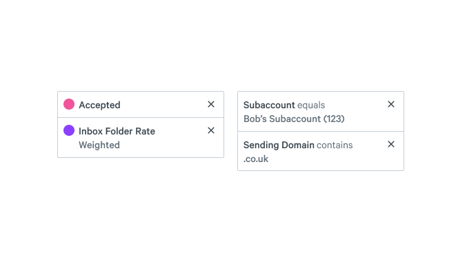
Matchbox now includes a new QueryCard component to represent data visualization legends and active filters for a query. This component is also available in the Figma UI Kit.
Progress
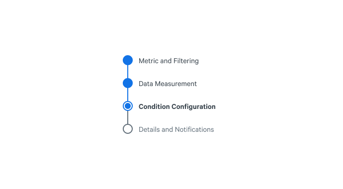
This new Progress component visually represents a linear flow with navigation capabilities. This component is also available in the Figma UI Kit.
CheckboxCard
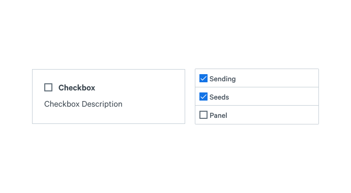
Similar to the RadioCard component, the CheckboxCard component provides additional visual weight to a traditional checkbox. This component is also available in the Figma UI Kit.
Existing Components
Tag
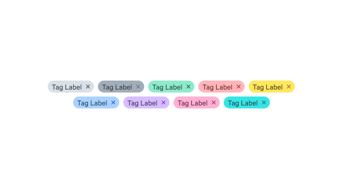
Tag colors have been redesigned for accessibility purposes and are now more consistent with other Matchbox design elements.
RadioCard
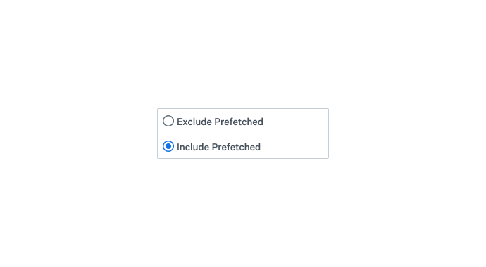
RadioCards now support a smaller size, accessible via a new size prop. RadioCard.Group now supports zero spacing between its children via a new space prop.
Other Changes and Fixes
- Table.SortButton icons are now bottom aligned
- RadioCard.Group now accepts a
helpTextprop